Validating a better experience with real users – in 4 days
Envato—one of Australia’s most successful technology startups—has one of the largest Ruby engineering teams in the World. They work in small agile teams building and iterating on features across Envato’s range of digital marketplaces. Roadmaps are long and backlogs are large making prioritising how this team is deployed very important. But could this team be used to test a ‘hunch’ about an idea revealed from observing customers?
Browsing for videos sucks
VideoHive—one of Envato’s 8 marketplaces—sells video assets such as stock footage and After Effects templates. Typical customers are video production professionals and buy assets very regularly. User research revealed how they browsed for the assets they bought. Using at least two large screens was normal, one for the project and another for searching and previewing clips for the project. Often they would preview clips on one screen alongside footage or audio on the other, to make sure things fitted nicely together.
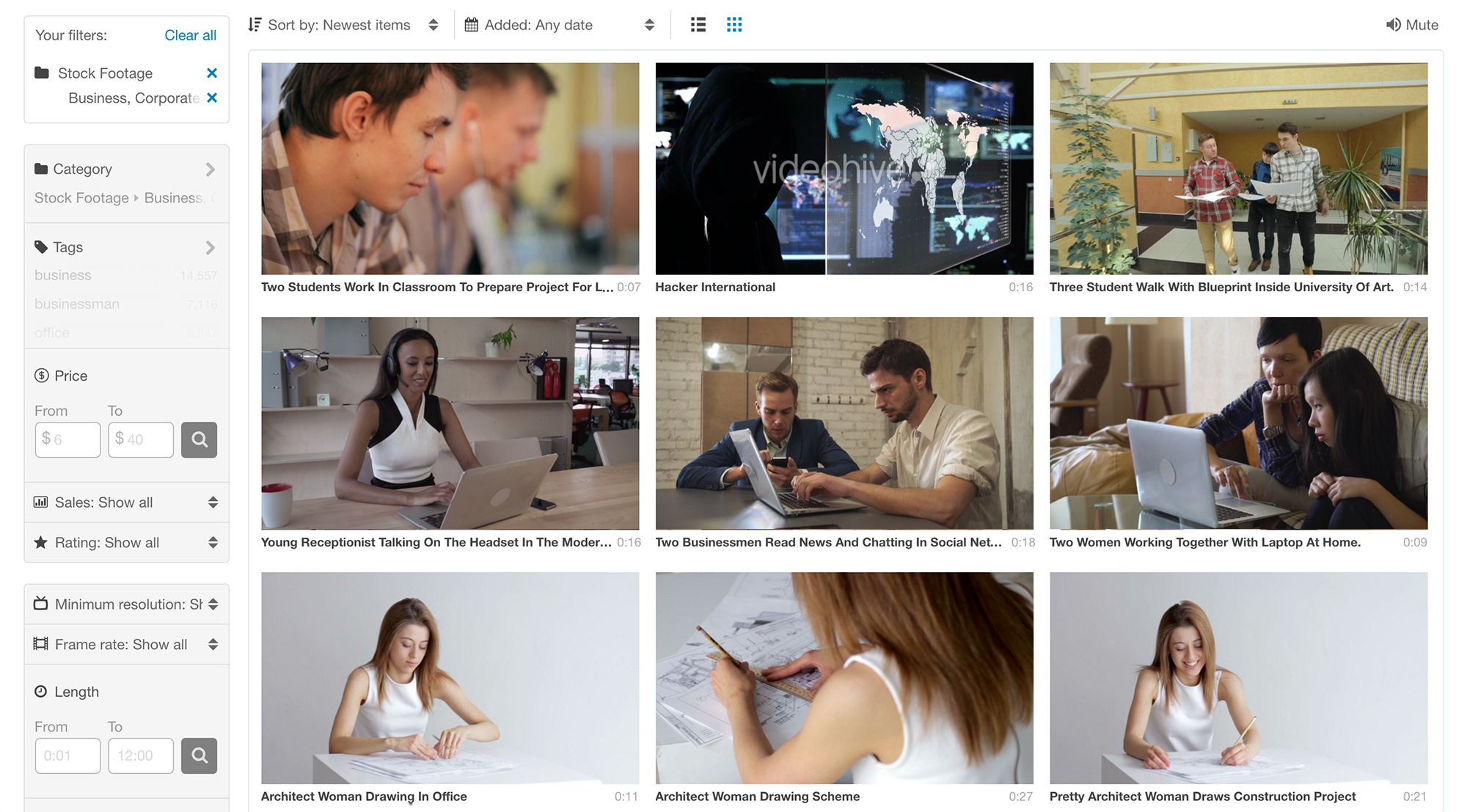
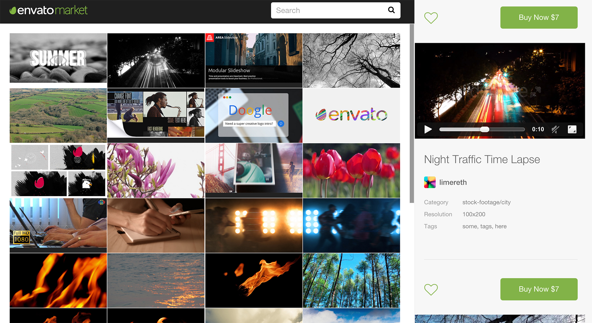
Original VideoHive browsing experience
However, VideoHive was not built for this workflow. The video marketplace used the same browsing experience as ThemeForest—Envato’s most successful marketplace selling website templates. But browsing videos is not the same as browsing for website templates. Website templates relied on the finer details given in the product page, video buyers would rarely go past the search results page, previewing as many clips as possible in one page.
Preview images were small, the site width was fixed (not responding to the size of the screen) and previewing clips required a user to hover over a clip and wait for a panel to appear and the preview to load. Sound came on automatically, annoying if you need to check the clip fits with another audio source. The resulting experience led to power users viewing fewer clips than they did on competitor sites therefore being less likely to find the clip they needed.
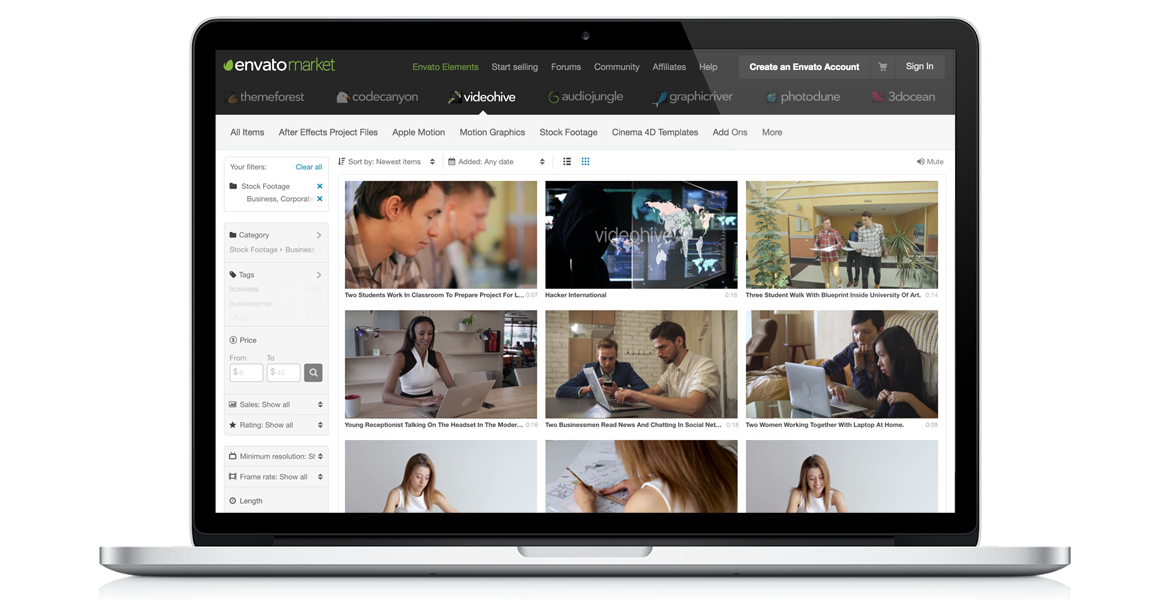
Original VideoHive video clip preview
If the video browsing experience was improved would video production professionals find it easier and quicker to browse the collection? And would this lead to more sales?
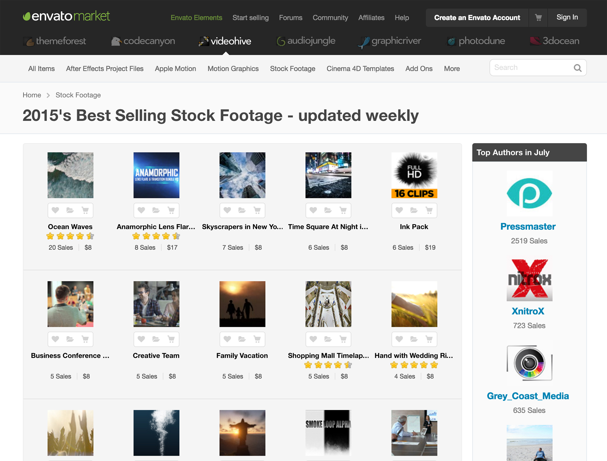
Two sides to one challenge
The design team needed to find this out. But they didn’t want to design something to sit in a backlog to be built later. They needed to test the effectiveness of the solution with real users, but prototyping a search was hard. To provide a realistic search experience needed real content that the test participant needed to search. Without being able to prove a solution solves the problem the team couldn’t tell if the actual feature was worth building before other more concrete features in the roadmap.
Borrowing from the Design Sprint by Google Ventures the team ran a cross-functional sprint to ideate, build and test a real prototype with real users and a real search query. The team—2 designers and 2 front-end developers—had 4 days to prove the feature worthy of being built.
The sprint
The first day started arranging a user test session for the last day.
Then the team unpacked the problem. Looking at all the research done and testing the current implementation. Then, using ‘How might we…’ statements the team created and affinity mapped enough ideas to cover an entire wall of the meeting room—which had been taken over for the duration of the sprint. From these ideas the team moved into rapid sketching to explore as many ideas as possible. Once the ideas with the most potential had been identified they were storyboarded to explore in more detail.
On the second day, all the ideas were reviewed and a decision made on the ideas to build into the prototype. Ideas explored included bigger previews that ran on hover, and paused when the user moved to the next clip and played again if the user returned. A drawer for collecting potential clips to view later or compare against those in the current search results. And a widescreen, responsive display for the search results.
The team designed and built in code. The functionality needed testing on it’s usefulness and not on a slick interface so high fidelity design was ignored in favour of just enough to make the features usable. At this point it was easy to start adding cool new features or experience enhancements, such as making the drawer slide in and out of view. These had to be ignored as the prototype needed to be just enough to prove it’s viability, a great experience could follow later.
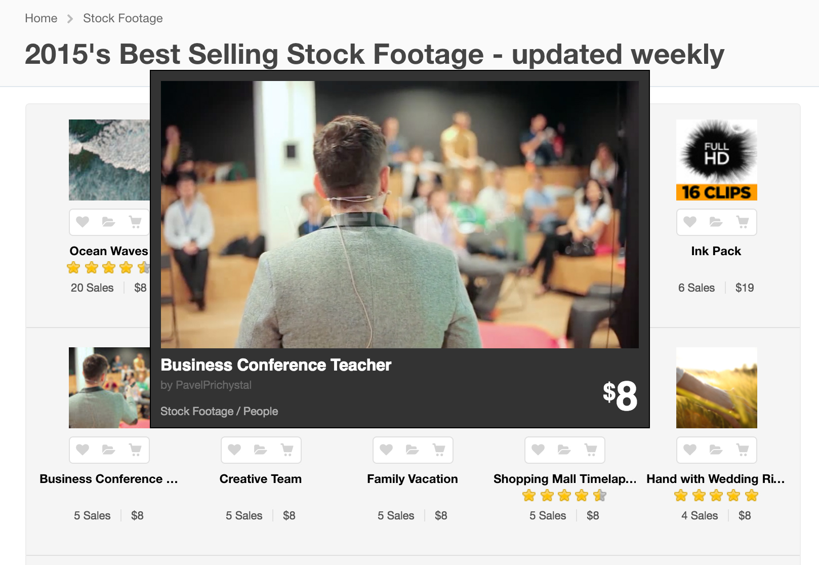
The prototype used to test the ideas
By the last day the team had a fully functional prototype using an API to search the real content of VideoHive. It wasn’t pretty but it worked. Next was to test with a handful of real users and find out if it worked.
Testing on real users
Because the prototype was built to run a full search query using VideoHives collection of video assets the user test was pretty simple. Each participant was asked to find a video asset for a project they are currently working on. These ranged from finding a video for a blog post to finding a useful After Effects template to use in a bigger project. First participants where asked to use the current VideoHive site, then the new prototype.
The reaction was very positive. Even though the experience didn’t look great the participants instantly saw the real benefit of time saved browsing for videos. Even better, one of the participants actually bought a video they found in the test.
The sprint was a complete success. A few weeks later the full feature made it onto the roadmap and into the hand of all customers. Along with some of the other ideas such as a mute switch to turn off preview audio.