Redesigning the front door – Envato sign-up and sign-in
Envato—one of the most successful technology startups in Australia—run eight digital marketplaces aimed at creatives such as designers and developers. These marketplaces cover everything from videos, photos and audio assets to website themes and code plugins. In fact, everything needed to complete a creative project.
Each marketplace has it’s own brand, from ThemeForest—one of the top 100 websites in the world—selling website themes to VideoHive the market leader in AfterEffects assets. However all of them run from the same platform, Envato Market. A user account on Envato Market gives the user access to all eight marketplaces.
Confusion for old and new users alike
The sign-up process for an Envato Market account was long and confusing for users. Even sign-in caused confusion. There was a significant drop-out rate during sign-up which took a new user through many steps—as many as 14 in some cases—across multiple domains and into their inbox for verification of their email address. A successful sign-up left a user on the home page, not the page they started the process from, forcing them to restart their first purchase.
Existing sign-up
User research discovered there was a lack of trust in Envato and a confusion over which account was needed for what. The users interacted with the marketplace brand such as ThemeForest. The introduction of the Envato brand at the point of giving personal information led users to wonder who they where dealing with. A significant number of potential new users dropped out at this point.
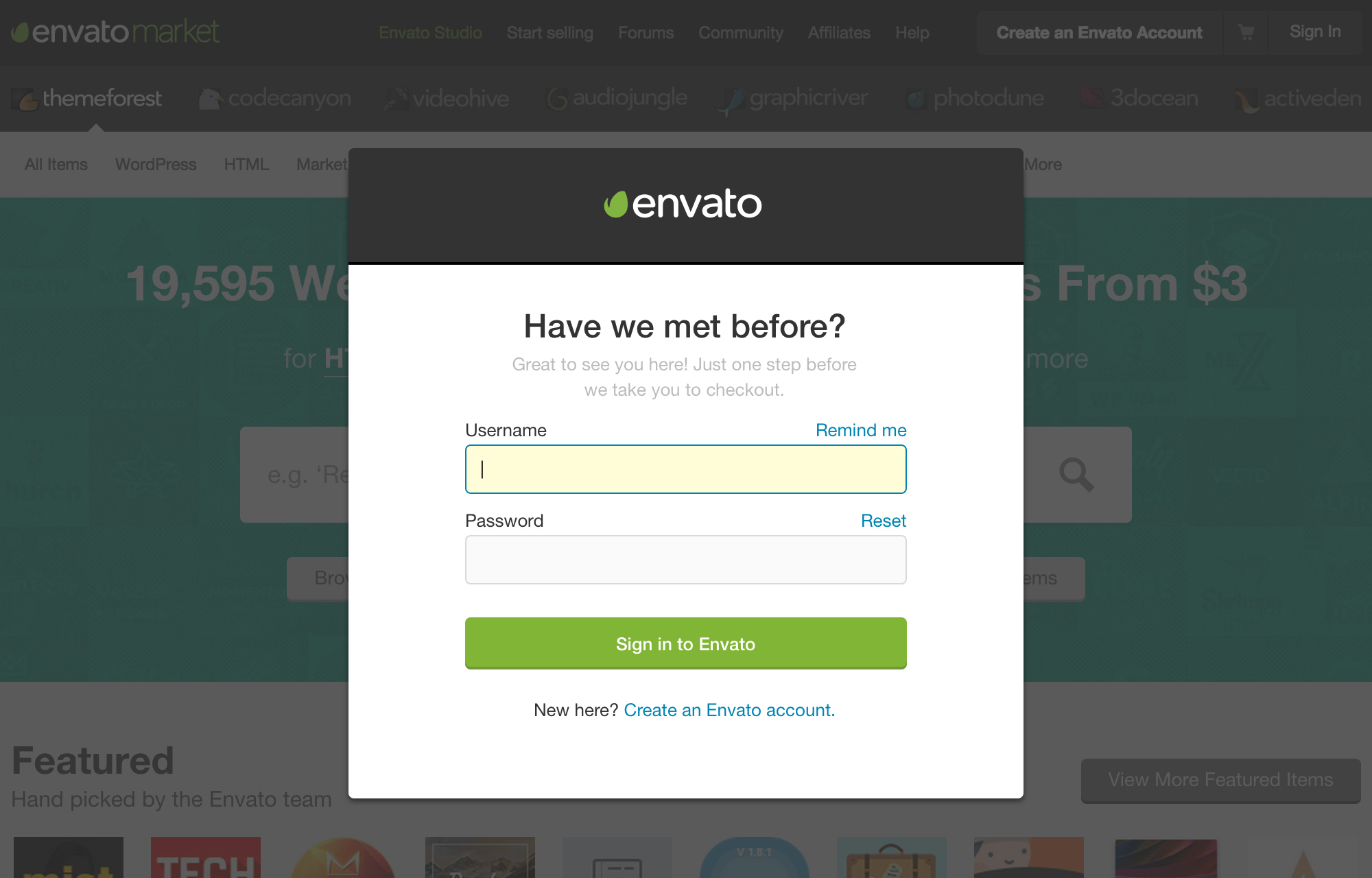
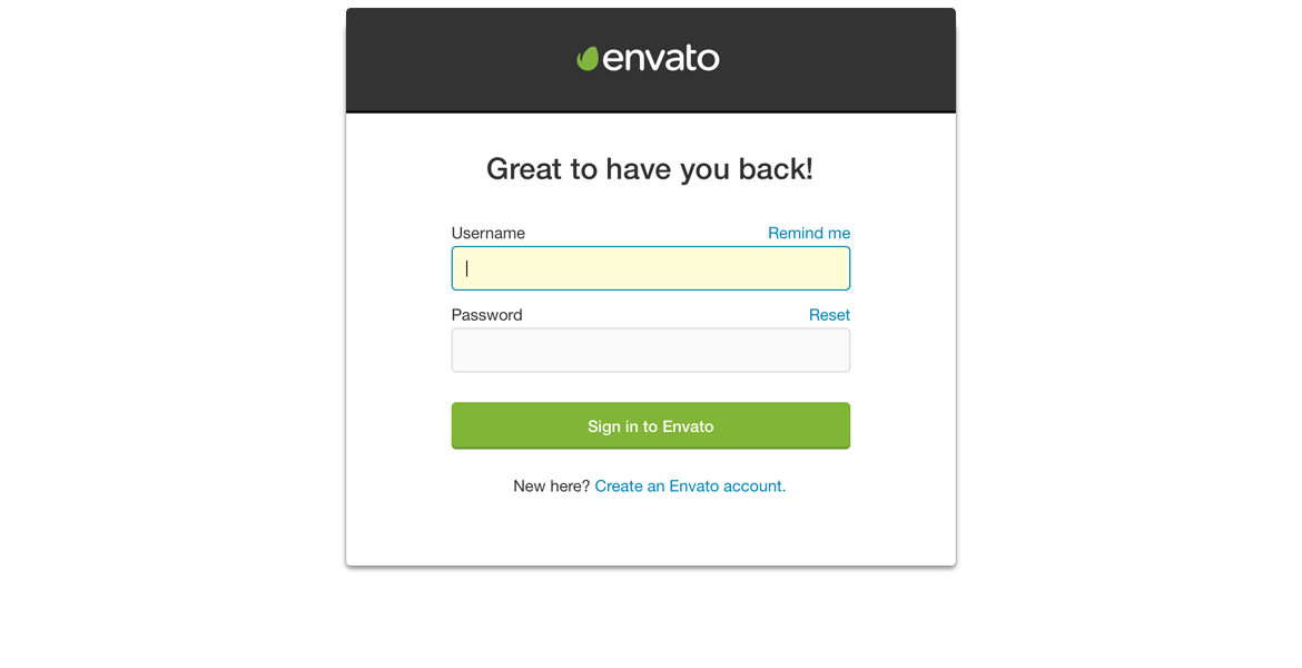
Sign-in was only a little better, taking the user to a different domain and back again. Users were confused over how to sign-in to other marketplaces as they didn’t get the Envato connection between the brands.
Building a new relationship with the master brand
Envato needed to introduce their master brand as the brand behind the user’s account. Building the relationship by closely associating the brand with the marketplaces. The hypothesis showed that making the sign-up process easier and more trustworthy would increase the number of new members and first-time purchases.
Redesigning the front door
Working closely with the product team, the design team mapped out the existing sign-up experience to find the areas to improve. A series of experiments were set up using Google Forms to simulate the sign-up form. A number of options—from breaking up the data collection into sections to the actual input field labels and help text—were tested with over 300 users across 30 different cultural backgrounds and first languages. Using Google Forms enabled the team to test the ideas within a matter of hours and also check that the user data collected was accurate.
The results highlighted a number of surprising insights that would shape the sign-up process going forward. Such as:
- Western name format—assumed to be a standard approach globally—doesn’t work for a global audience. Not everyone’s name fits into this western format. Even the W3C suggested format tested poorly. We discovered that some users used a fake western name to get round this issue.
- Help text and confirmation—such as email address formats—were not required. The typical user is familiar with these kind of formats and enters them quite often, usually letting their browser complete these fields for them.
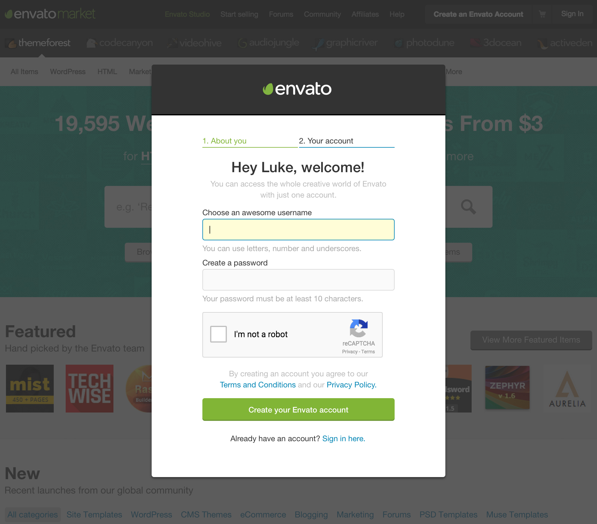
- Usernames didn’t make a lot of sense, users expected this to be their email address.
- Password rules are confusing, and following the rules doesn’t necessarily mean a secure password.
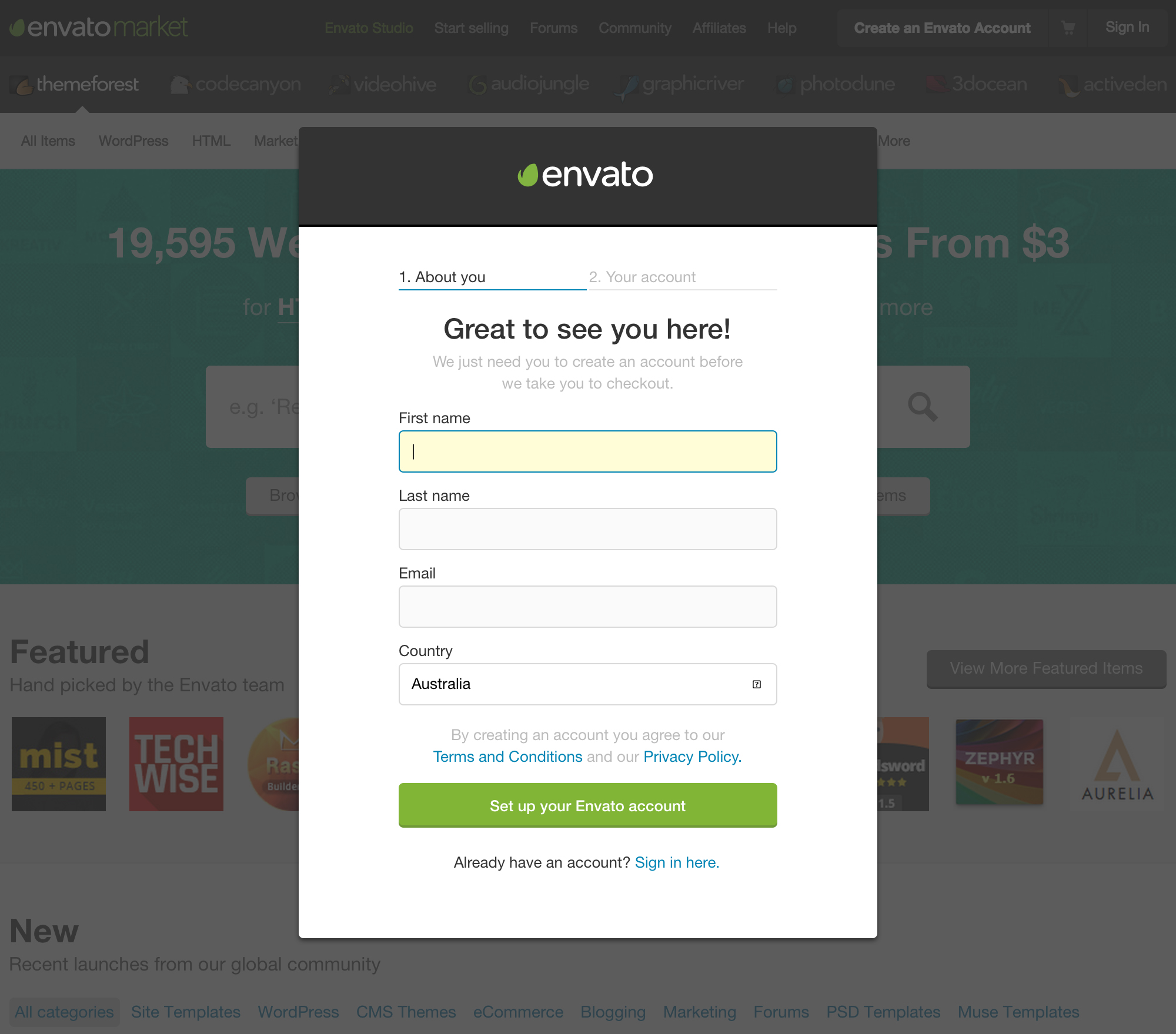
- Splitting the form into 2 separate sections made the experience stickier and more personal increasing the chance of completion. Breaking up the flow to collect personal details first also helped the required username make more sense to the user.
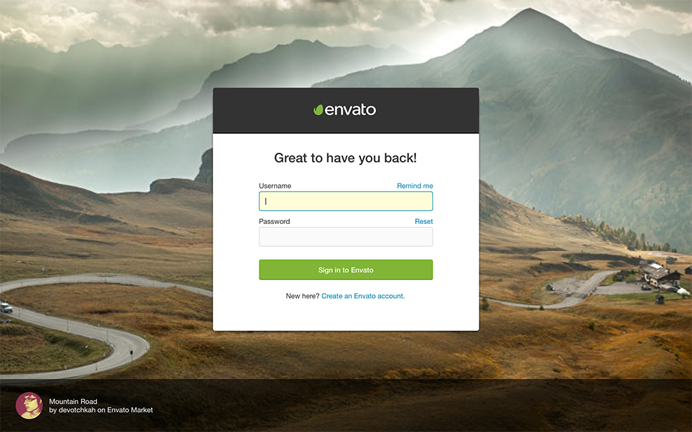
Following the research the design team redesigned the sign-up process as a component that could be used across all Envato products. Launching as a lightbox over the marketplace that the user wanted to sign up to. It introduced the Envato brand while maintaining the association and trust of the marketplace brand. This also ensured the user stayed on the same domain and kept their place within the purchase process. The number of steps were greatly reduced—to just 4 in some cases—following the insight collected from the test.
Bringing content from the Envato Market community into the design
Sign-up was the front door to the Envato ecosystem so several visual design options were explored to make the right first impression to new users. Options included bringing content from the Envato Market community into the design. The copy throughout the process was carefully considered and written in the right tone of voice to make it welcoming and friendly. Several rounds of user testings narrowed the designs down to the final version.
A UI kit was built for the new components such as form fields and inputs and the new lightbox format. This made these new components available to other teams to use across all Envato products and easily implementable with a consistent codebase. The design was then rolled out gradually to ensure the new design created the intended increase in sign-ups. Sign-in was also updated to ensure consistency.
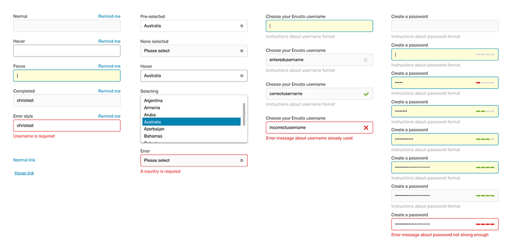
UI Kit
Welcoming more new users
The results of the new sign-up process were as expected, with a few surprises. A great reduction in the number of drop-outs from sign-up was witnessed almost immediately as the hypothesis had predicted.
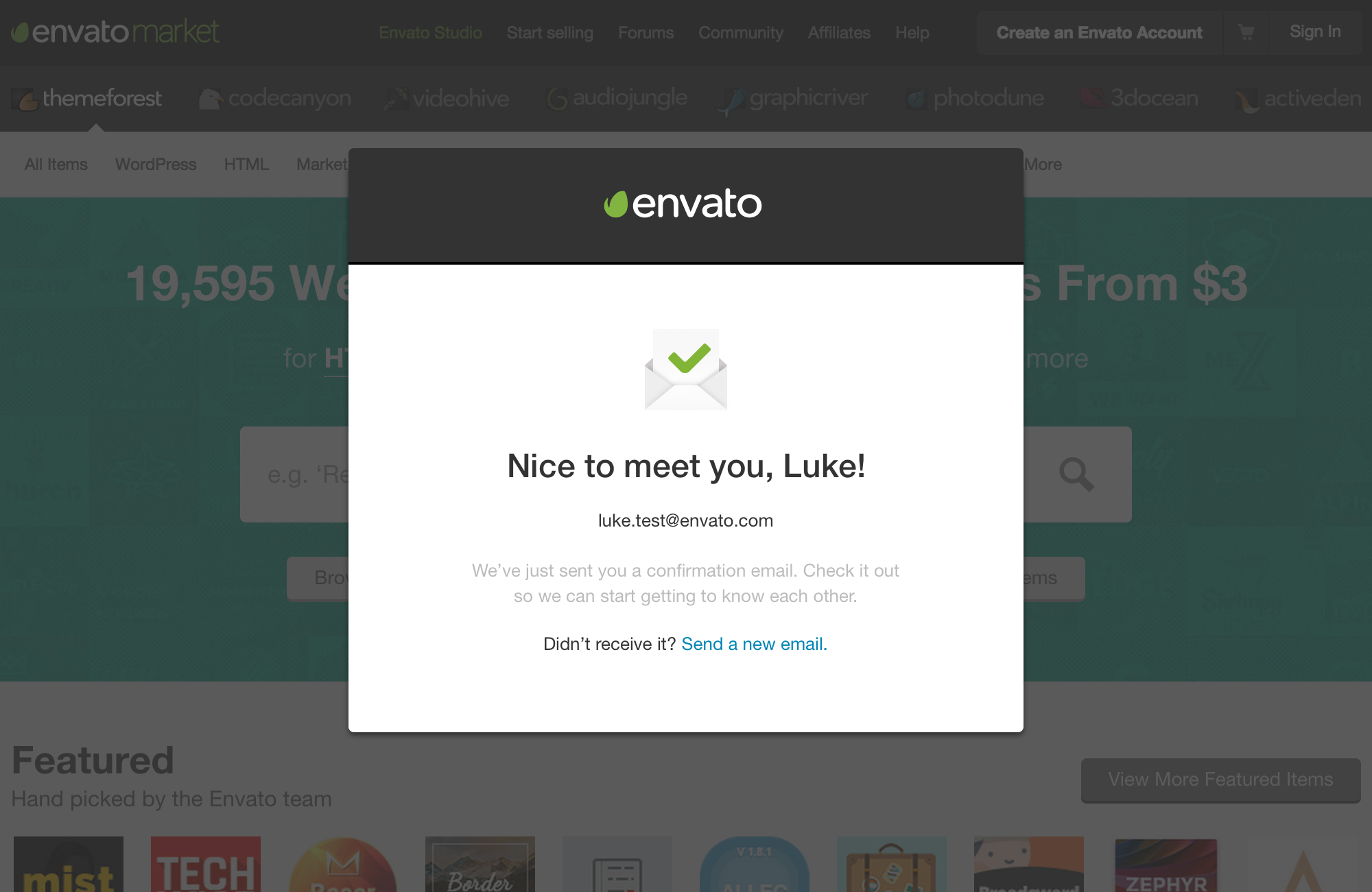
Listening to the user research, the confirmation and help provided for email address entry was removed leaving just a simple text field. However, this resulted in a dramatic increase in incorrect email addresses leading to more bounces on email newsletters and an increase in support requests to recover lost accounts and forgotten passwords. Also removing the verification of email addresses caused an increase in the rate of fraud. Email confirmation, help and verification were reverted back and future work would explore how to avoid needing to send the user to their inbox to verify their email address while maintaining the level of fraud.
As a result of creating the new service a consistent sign-up experience could be provided across all Envato products and marketplaces strengthening the brand and building trust with the users. The service was then integrated into the purchase process to enable sign-up during checkout.